
When you go shopping, the packaging of goods often catches your attention first. After all, this is the first opportunity for the brand to leave a deep impression on you. However, some companies have seized this opportunity and made good use of it, while others find it difficult to make meaningful use of packaging.
In addition, brands also need to invest time in establishing effective brand colors to create consistency throughout the entire packaging process. When different product lines appear to not belong to the same brand family, or they do not have a consistent brand palette, this may confuse buyers and lead to a decrease in sales.
When you learn how to choose brand colors, the following information can help you get started.
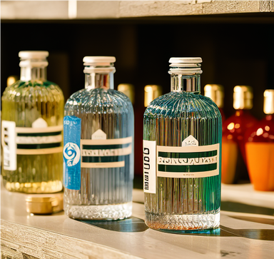
Pantone Color System: The Pantone Color System, also known as the Pantone Matching System, is a universal standardized system that helps with color selection and matching. Using this intuitive numbering system to identify different colors can make it easier to obtain accurate color tone matching and find complementary brand colors for design.
In the Pantone color system, there are 1114 different colors, each with its unique color name and identification number. Using this standardization system, when coordinating packaging or sending label requests to regional manufacturers, simply refer to Pantone charts to standardize the color usage for all markets and locations.
Using the Pantone color system helps ensure consistency in the brand’s color palette, which has a significant impact on the customer’s perception of your business. With a standardized color chart, you can feel more confident in color compatibility and consistency.
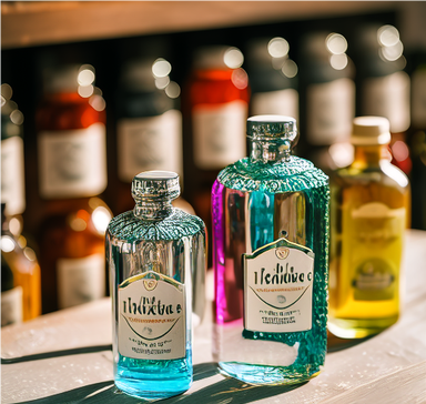
Psychology of Color Types: Different colors affect people in completely different ways. Red attracts the most attention, raises our blood pressure, and can represent anything from strength to danger.
The green color tone imitates natural colors, symbolizing growth and harmony. Many people believe that green is beneficial to the body and mind because it can have a calming effect and help slow down the body’s metabolism.
Blue is a unique and authentic color that looks calm and refreshing. Contrary to the intensity and passion of red, blue is more relaxed and peaceful. If you imagine something calm, you are likely to think of blue things, such as calm water bodies.
Brown is reliable and sturdy, orange is full of vitality and happiness, yellow represents happiness and wisdom, and pink represents tenderness, love, and thoughtfulness. Having so many different color and emotional combinations is crucial to achieving the right balance with your brand’s color psychology.
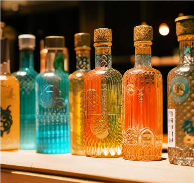
Choose the best color for your brand packaging: By following these simple steps, you can more easily explore the brand color psychology and choose the perfect brand color according to your packaging needs.
Firstly, clarify your target demographic data. Too many companies claim to sell products to “everyone”, even if they may not necessarily sell products that are universally attractive. Identify the unique features of your brand and communicate with whom. Then, you can customize your brand colors based on this vision.
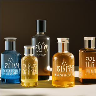
If you are looking for inspiration, this can also be very helpful. For example, look at what your competitors are promoting with their packaging. Have you seen stories or themes with similar colors? You can always draw inspiration from successful designs, or use this time to discover trends and find colors that help your brand stand out.
The secret to developing perfect and colorful product packaging: Once you have outlined your packaging process, you can unravel some hidden secrets behind packaging color selection.

This step is very important because packaging is your first opportunity to impress customers. High quality packaging should clearly and concisely reflect your brand. An incorrect brand color scheme may convey information that you do not want to convey.
To choose the perfect brand color for your packaging, please make sure your packaging imitates or stands out from competitors. If your product is difficult to quickly discover in a range of products, the color and brand may be cancelled.
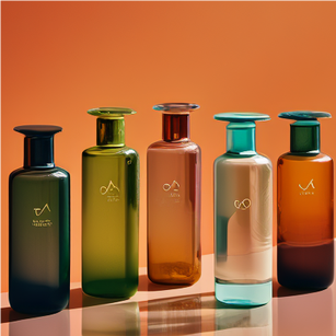
In addition, it is important to determine whether your product package is suitable for your target audience. Use colors that complement the core emotions you want the product to evoke. Utilize colors in a way that is meaningful to both the eyes and the brain.
Bolite’s rich and colorful solutions: Colorful jars and glass jars combine practicality and aesthetics, highlighting your brand’s color scheme.
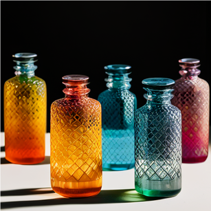
For example, take Bolite’s 111111111111111111 as an example. The straight body panel design is perfect for silk screen printing and perfect labeling applications, and cobalt blue will also become popular on shelves, attracting the attention of customers.
We also offer the same green large bead Boston round glass bottle, which is very suitable for screen printing, stickers, labels, etc. In addition, you can choose between sealing options such as flat cap options or dropper tops, which are ideal choices for bottled liquids.
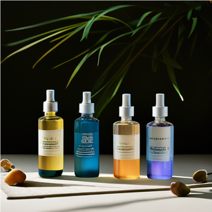
There are also Bolite’s rich amber bottles. From glass dropper bottles to straight edge flush cans, the amber glass series is perfect for filtering light and extending the shelf life of the contents.
Contact us immediately to learn more about Bolite and our colorful glass jars, bottles, and seals. We are here to help you meet all your packaging and sealing needs!
No matter which industry you are in, no matter what kind of products you sell. If you want to know how to choose brand colors, Bolite provides colored containers for packaging products and conveying brand information.
If you’re in the market for a suitable storage and packaging material,
we have thousands of different types of glass products available.
Our professional team is here to support your business and share you valuable experiences.
Feel free to inquire!
Contact Us


